PORTFOLIO > DATA ANALYSIS & DATA SCIENCE
Hi there, my name is Erick Atanga.
As you can tell I am a jack of all trades. I have many interests, I enjoy learning about different industries - ranging from sales, to finance, to healthcare, to Sports - and I like applying different methods to solve problems.
I believe that drawing from different disciplines allows me to ask compelling questions,
and come up with ingenious solutions for key problems.
Tools: • Excel • Tableau • Python • R • PowerBI • SQL
Skills: • Exploratory Data Analysis • Data Wrangling • Data Visualization • Data Science (ML, Clustering, Segmentation) • APIs and Data Flow
Selected Samples
Data Engineering with AI: Automated Data Enrichment in Google Sheets using Apps Script and OpenAI
• Prompt Engineering with OpenAI to build data pipeline and enrich data.
• Google Apps Script and Google Sheets.

Data Science: Predicting Used Car Prices with Python
• I created a Linear Regression Model to determine which factors influence the price.
• Python Data science libraries (pandas, seaborn, statsmodels and sklearn)
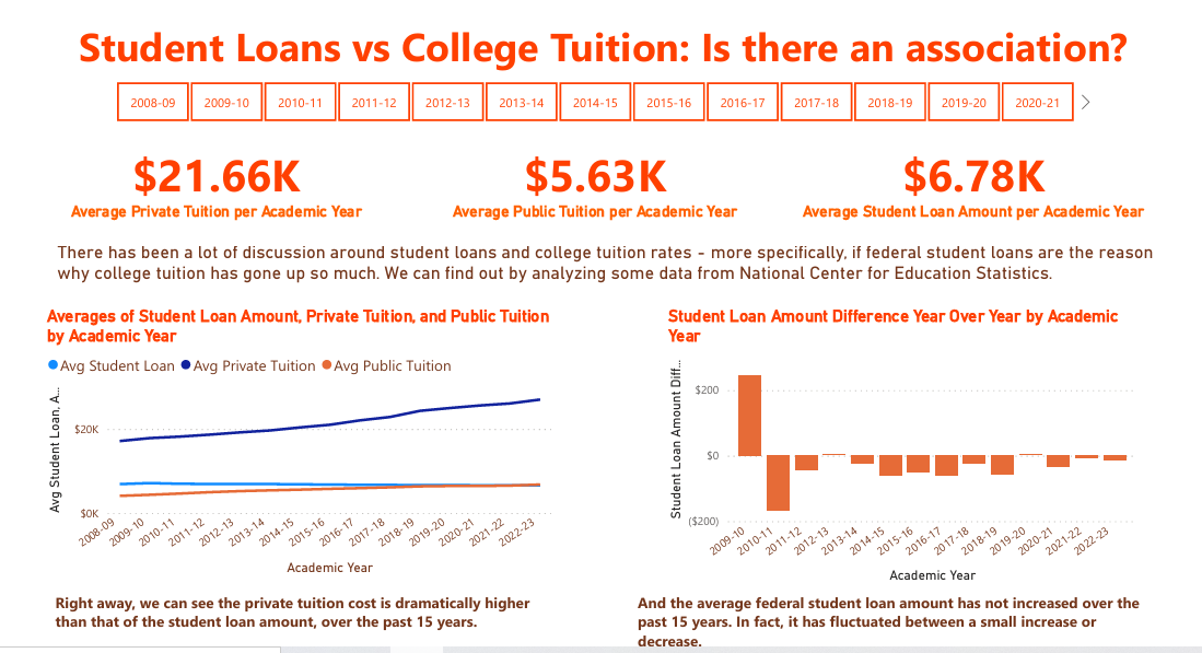
Are Federal Student Loans Causing College Tuition Rates to Rise? (Tableau and PowerBI)
• Uses SQL to query and join data (from NCES), and Tableau and PowerBI to visualize data.
• Click here for Tableau Dashboard and here for a PDF of PowerBI dashboard
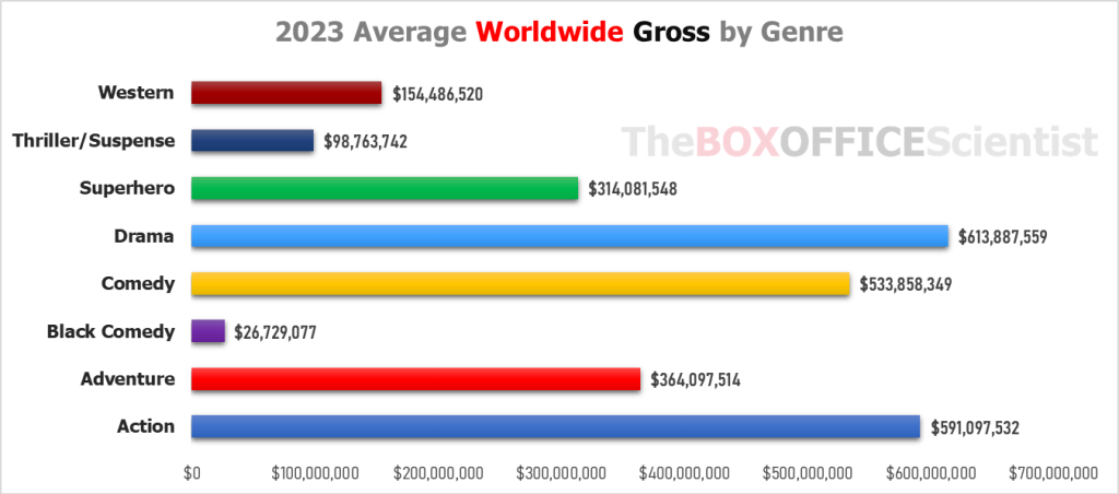
Business Analysis: Analyzing 2023 Summer Box Office Trends
• The project analyzes factors that caused several high profile summer blockbusters to flop financially in 2023.
• Excel and Power Query, Python (Data
• Data Wrangling, K-Means clustering
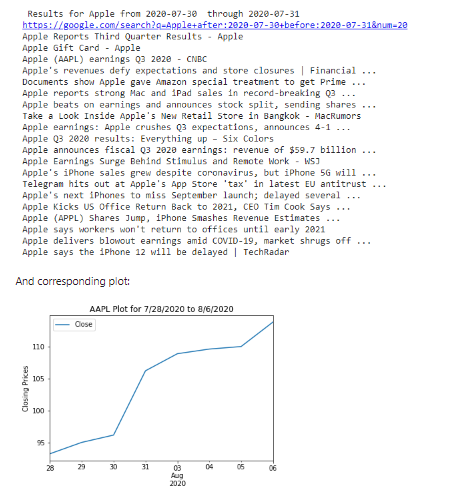
Programming with Python: Finding Association Between a Stock's Price and News
This is a program that displays data for popular stocks - more spefically, their stock prices over time - and that scrapes the web for articles corresponding to time periods where the stock price underwent a sudden and stark change. This is meant to investigate whether there is an association between the publicity/news of the stock, and the actual stock price (i.e. does negative or positive news about a company negatively or positvely influence the stock price? Or is there little association).
Link to Original Colab (last code block is faulty due to change in Yahoo Finance Reader library)
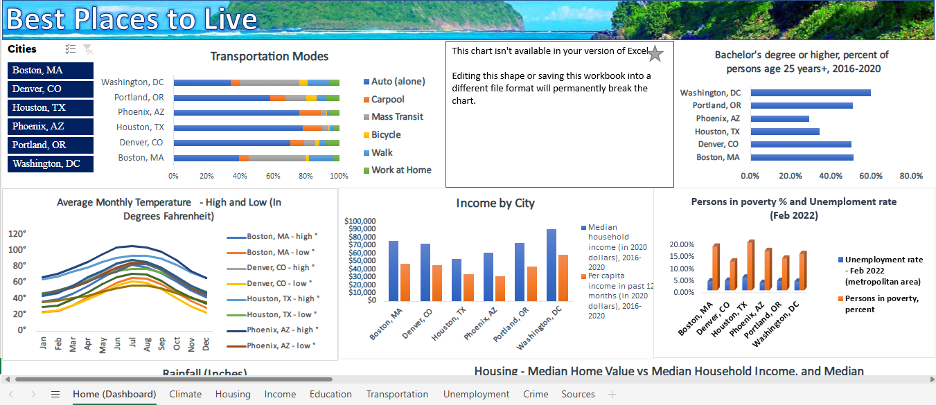
Data Management and Power Spreadsheets: Finding Best Cities to Live In
• Excel, Power Query, Power Pivot, and Data Models to clean up and simplify data
• Used Macros (VBA), PowerBI, and pivot charts to create a Dashboard
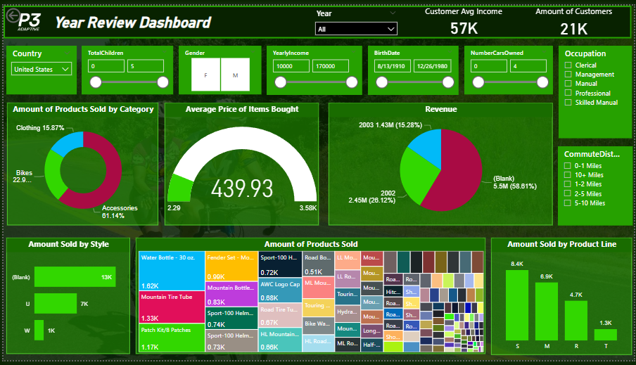
Unsupervised Machine Learning: Credit Card Clustering Project
• Wanna know which of your customer base is the strongest? The project demonstrates how by clustering and segmenting customers to give you clarity.
• Uses Python data science libraries (pandas, sklearn, matplotlib) to perform clustering/segmentation
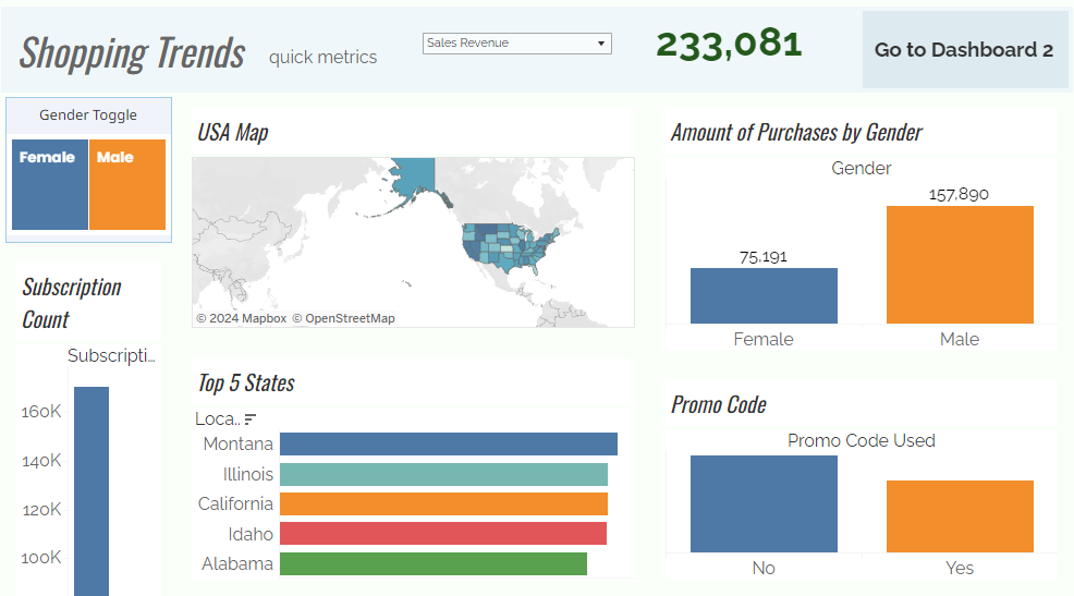
Data Visualization and Data Clustering: Shopping Trends
A dashboard built using Tableau Public displaying sales data and product info. Parameter Actions, Filter Actions, and more.
 1993-2001 in USD.png)
Industry Financial Analysis: Why Sega Stopped Making Game Consoles
Article analyzing why Sega stopped making video game consoles, using financial statements and historical context of the video game industry.

Data Science: New QB Stat - Adjusted Passer Rating
• An early prototype of a new statistic I invented to better assess NFL QB performances
• Sklearn, matplotlib, and various Python libraries
Correlation Test: Wins are a QB stat (Statistical Analysis)
• Conducted experiment to determine whether there is a correlation between QB performance and team wins.
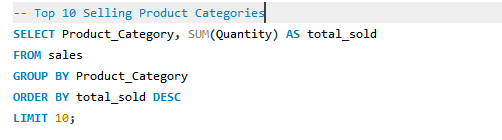
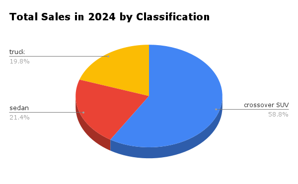
Sales Analysis with SQL and Python
• Utilizes simple sales dataset from Kaggle
• SQL, Python, Uploaded to GitHub
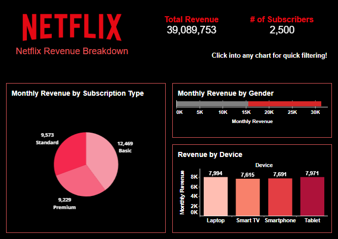
Data Visualization with Tableau
• Tableau Public Dashboard displaying limited KPIs from Netflix (dataset found from Kaggle).
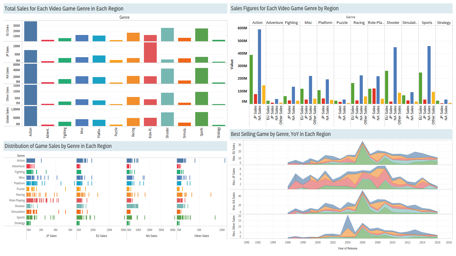
Business Intelligence and Analytics: Video Game Sales by Region
• Used SQL operations to select relevant data from dataset containing video games, sales, countries of origin, etc.
• Utilized Tableau to create data visualization that displayed how video game sales vary by region and game genre.
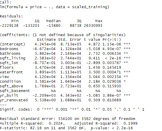
Analzying Housing Data with R
• K-means clustering and multiple regression